The web project team, working with technology partner Squiz, is now well into the design phase of the project.
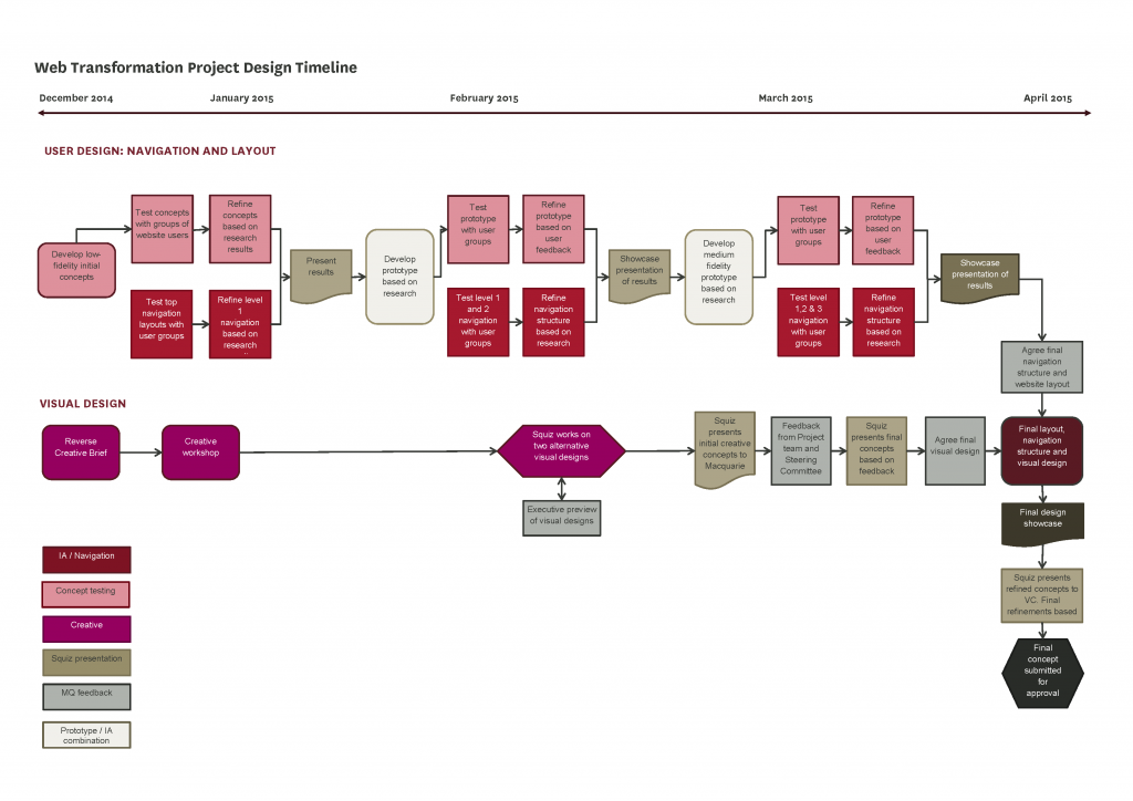
The user-centred design process will ensure that both the desktop and mobile versions of our website are not only beautiful to look at, but are also easy to use. At the moment there are two design processes running in parallel:
- User-centric design, which involves research into how users will find information on the website
- Visual design, which is how the website will look.
The final version of the website will combine the research results from both of these design processes.
Navigation and site layout
In January we began working on the navigation structure of the site (also known as information architecture, or IA for short). We used tree testing and wireframes (or prototypes) to find out how people find their way around the website.
Tree testing
We created an online exercise using the TreeJack tree testing tool, which a large number of people from our target user groups were asked to complete.
Tree testing is a usability technique for evaluating the findability of topics in a website. It’s also known as ‘reverse card sorting’ or ‘card-based classification’. Tree testing is done on a simplified text version of the site structure, without the influence of navigation aids and visual design.
The results of this test will allow us to refine the navigation structure. We plan to repeat the testing twice more by the end of March and to further refine the navigation based on the results.

Wireframe (prototype) testing
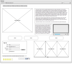
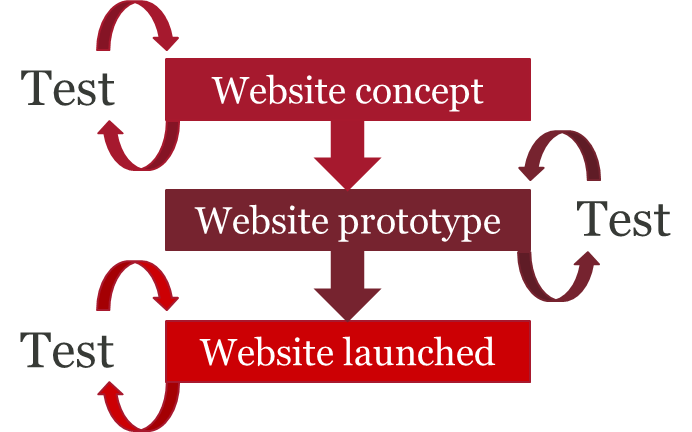
In conjunction with the tree testing, we have also developed some prototype layouts for both the desktop and mobile versions of the website. In December we tested these prototypes with small groups of people from our target user groups, and we have refined them based on the initial research. This month we are running further testing sessions to see how well the revised prototypes function. Once this testing is finished, we will tweak the design further. We plan to run another testing session early in March.
Visual design
In the lead-up to the design process, the project team from the university reviewed the features of a large number of websites and used this information to prepare a creative brief for our technology partner, Squiz. In return, Squiz presented a reverse creative brief that demonstrated how well they understood the initial creative brief. Squiz is now in the process of creating two alternative visual designs based on both the original creative brief and the Shared Identity project. The initial visual designs will be presented to the project team early in March.
Putting it all together
Once research into navigation and layout is complete, it will be incorporated into the visual design to create a final website design that is as functional as it is beautiful.


